Applying one Layer at a time


1. The student prepares the canvas using Gesso to seal and prime the canvas before the oil is applied. The gesso should be toned down; this way, the canvas doesn't lose its texture, and the oil will run smoothly.
Also will protect the canvas from deterioration; the oil will ruin the canvas quite fast if it has not been primed.
2. The student draws the artwork carefully, soft lines divide each color and each object. Students are not allowed to use a grid; they only find the middle point by drawing an "X" across the canvas, then drawing. It is very important to learn to look closer, to see the distance and locations correctly, to conquer and own the space and what lives in it.
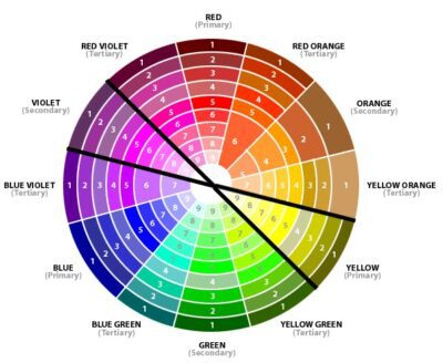
3. Look closer to the color wheel. Students look at the colors with caution, making note of how many different colors they can see within one color in particular. As they observe and study the blue in the sky, they should see all the colors the artist used in the process of making the sky. This way, starting by selecting the very opposite of the color they see is how the experience of the color begins. Every color has an opposite color, or what is called "complements."
After the opposite color is applied, the following layers will be done using the final color of that specific location. For example, when working with the blue of the sky, the initial color is to be an orange; the hue of that orange will be selected depending on the hue of the blue the student is looking for. Every layer applied after orange will be blue, and each layer has to be mixed with the correct kind of linseed oil until the color starts to show. This technique needs time, patience, and a touch of love.
Noticed that black and white are the last because they are not colors, and if used, they will change the hue of the colors radically, making it very difficult to manipulate and create the richness and the force colors are to have. For light or dark color, use linseed oil or the colors yellow and blue, respectively.


3. Look closer to the color wheel. Students look at the colors with caution, making note of how many different colors they can see within one color in particular. As they observe and study the blue in the sky, they should see all the colors the artist used in the process of making the sky. This way, starting by selecting the very opposite of the color they see is how the experience of the color begins. Every color has an opposite color, or what is called "complements."
After the opposite color is applied, the following layers will be done using the final color of that specific location. For example, when working with the blue of the sky, the initial color is to be an orange; the hue of that orange will be selected depending on the hue of the blue the student is looking for. Every layer applied after orange will be blue, and each layer has to be mixed with the correct kind of linseed oil until the color starts to show. This technique needs time, patience, and a touch of love.
They learn and understand the oil painting process and the pigments
to be used. Students have a variety of bound
oils to choose from. Before starting the final piece, a second little canvas will be ready to be the proof and testing for oils, colors, and brushes.
Different oils to be tested
·
poppyseed oil
walnut oil
safflower oil
linseed oil
To feel and understand that different oils allow for
different drying, textures, and finishings is a fundamental part of students' success.
Brushes

During the art experience, students go through many different
brushes that will facilitate every stroke, every feeling, and detail of colors and objects. When crafting the blue of the water, or the blue of the sky brushes will make as well colors a great difference. Brushes are short, long, hard, soft, and different types of materials, determining this way the intention of each stroke.
Students will learn to:
Students will learn to:
- Noticing Deeply - by identifying and seeing closely
- Embodying - Students will experience their own art through their emotions
- Making Connections - From the original piece of art to its own
- Exhibit Empathy - By learning how to give and take feedback
- Questioning - Asking open and confident questions about the learning experience, their perception, and observations about the technique, and, very importantly, students learn to co-learn and co-teach.
- Reflecting/Assessing - During the process and presentation, the student identifies and understands others' and their own work.
Questions, opinions, email me at afrancoteachingartist@gmail.com
Comments
Post a Comment